Sea Salt
CSP-95 · Benjamin Moore


Benjamin Moore
Sea Salt
CSP-95
Subtle yellow-beige, a warm color
- Color family
- Neutral
- Sold for
- Interior
Benjamin Moore Sea Salt CSP-95 is a soft warm greige, and it is not the pale green that Sherwin-Williams sells under the same name. Its LRV of 61 puts it in the light band, bright enough to keep a room open while still reading as a color against white trim. Our method reads it as a subtle yellow-beige, so it sits with oak, rattan and cream more easily than with cool gray tile.
Source: Benjamin Moore's color data. Undertone labels describe our calculation, not the paint formula or a test in your room. How we assess colors.
Is Sea Salt warm or cool? Undertones by the numbers
leans yellow
Undertone
Subtle yellow-beige
A gentle lean, quiet on the wall.
Benjamin Moore Sea Salt has a muted warm swatch, quite different from Sherwin-Williams Sea Salt SW 6204. On a wall it behaves like a warm putty: beige when it sits beside a true gray, gray when it sits beside a true beige. White trim is what settles it, and a clean white reads brighter against it than a cream does. Warm oak, jute and unlacquered brass pull the beige forward, while cool gray tile and blue-white bulbs strip it back toward plain gray. Against Edgecomb Gray HC-173 it is the quieter of the two, with less of the tan that Edgecomb carries.
Sea Salt in different lighting
North light is where Sea Salt changes most: the beige thins out and the color settles toward a plain warm gray, so a north bedroom wants warm bulbs and a wood floor to keep it from going flat. South rooms give the cream back, and it looks closest to the chip there in the afternoon. East light is warmest at breakfast and grayer by evening. West sun late in the day can tip it toward gold on a long wall. Keep bulbs at 2700K to 3000K, since 4000K drains the warmth out of it.
Watch for
- Goes flat and gray in a north room lit by cool LEDs
- Tips toward gold on a west-facing wall in late afternoon sun
- Has none of the green people expect from the Sherwin-Williams color of the same name
Best rooms and surfaces for Sea Salt
Sea Salt is a wall color first, and Benjamin Moore sells it for interiors only, so it stays inside. Most of the searches for it name a bedroom, and that is where it does its best work: warm enough to be restful, light enough that one window is sufficient. Across an open kitchen and living room it reads as a single soft color, with white cabinets standing clearly in front of it. On an island or a vanity it turns into a pale putty rather than a real color, so give it a lighter wall behind. A dark den is the wrong room, because the warmth thins there and only the gray is left.
Try Sea Salt on your own walls
Upload a photo of your room, or the outside of your house, and TryMyHome renders Sea Salt onto the walls for an illustrative preview beside your floors and furniture. Confirm the color with a physical sample. Your first 3 renders are free.
Sea Salt vs Sea Salt, Pale Oak, Agreeable Gray and Edgecomb Gray
 Sea SaltSea Salt
Sea Salt vs Sea Salt SW 6204
Sea Salt is a touch darker; undertone subtle yellow-beige vs subtle green. Based on published LRV and our swatch classification.
Sea Salt SW 6204 is the color most people mean when they type the name, and it is a different thing entirely: a pale green-gray at an LRV of 63, two points lighter and cooler than this one. The Sherwin-Williams color leans green and reads coastal. The Benjamin Moore color leans beige and reads warm. Take the green one if you want a tint on the walls, this one if you want a greige that stays out of the way.
 Pale OakSea Salt
Sea Salt vs Pale Oak OC-20
Sea Salt is noticeably darker; both fall in our subtle yellow-beige category. Based on published LRV and our swatch classification.
Pale Oak OC-20 is the pair searched most often on the Benjamin Moore side. It measures about eight points lighter, at an LRV of 69, with a more muted swatch, so it reads almost white on a sunny wall where Sea Salt still reads as a color. Both are warm and neither is fussy. Choose Pale Oak for a room you want pale and open, and Sea Salt where the walls should have some body to them.
 Agreeable GraySea Salt
Sea Salt vs Agreeable Gray SW 7029
Sea Salt is a touch lighter; both fall in our subtle yellow-beige category. Based on published LRV and our swatch classification.
Agreeable Gray SW 7029 is the near twin: one point apart in lightness and the same subtle yellow-beige in our swatch comparison. Put the chips side by side and few people can call which is which, and either one can run through a whole house. The tiebreaker is usually the store rather than the color. In a room full of orange-toned oak, Sea Salt looks a shade cleaner of the two.
 Edgecomb GraySea Salt
Sea Salt vs Edgecomb Gray HC-173
Sea Salt is a touch darker; undertone subtle yellow-beige vs noticeable yellow-beige. Based on published LRV and our swatch classification.
Edgecomb Gray HC-173 sits two points lighter, at an LRV of 63, and carries clearly more tan, enough that it reads as a beige where Sea Salt reads as a greige. Edgecomb is the warmer one under lamplight and the one that fights cool tile harder. Take Edgecomb Gray when the room already has cream trim and oak. Take Sea Salt when there is gray in the floor or the counters.
Questions about Sea Salt
Does Sea Salt CSP-95 look green or pink?
Sea Salt CSP-95 has a warm gray-beige digital swatch, unlike the pale green of Sherwin-Williams Sea Salt SW 6204. A green or pink-looking cast is still possible in a particular setting. Confirm the brand and code, then compare a sample with the room's fixed finishes.
Is there a Sherwin-Williams match for Sea Salt CSP-95?
Yes, but not the color that shares the name. In our swatch calculation Gossamer Veil SW 9165 is the nearest Sherwin-Williams color, near enough to be a useful candidate for side-by-side sampling, and Agreeable Gray SW 7029 comes second. Sea Salt SW 6204 is a green, and swapping one for the other changes the room.
What colors go with Sea Salt CSP-95?
Benjamin Moore puts it with Chantilly Lace OC-65, the pale Grandma's China CSP-365 and two darks, Arctic Seal CSP-15 and Lush AF-475. In practice it takes warm wood, jute, cream linen and black metal without a fight. Deep green and charcoal work as accents. Strong yellow-beige next to it makes the walls look gray.
Is Sea Salt CSP-95 a good bathroom color?
Yes, in a bathroom with warm finishes. It is light enough for one with no window, and the warm lean keeps it from going cold under a vanity light as long as the bulbs stay at 2700K to 3000K. Beside cool gray porcelain it can look dingy rather than soft, so hold the sample against the tile before you buy.
What is one shade darker than Sea Salt CSP-95?
Greenwich Gate CSP-170, the next step down in Benjamin Moore's own set, about ten points darker and a little more tan. One step up is Barely There CSP-725, which is closer to an off-white. If you want a smaller move than either, Rodeo 1534 measures a touch darker and Penthouse CSP-35 a touch lighter.
Get a sample before you paint
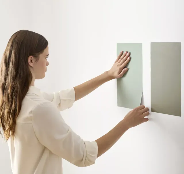
Use the visualizer to narrow your shortlist, then confirm the finalist on your actual wall. A peel-and-stick sample of Sea Salt, checked in morning and evening light, is the last step before a gallon.
- Made with real paint
- Delivered next day
- Peels off clean
 4.8 · 1,842 reviews

Trim, ceiling and coordinating colors for Sea Salt
Benjamin Moore names Chantilly Lace OC-65 among the colors it puts with Sea Salt, and that is the crisp end of the range: a clean white that lets the beige read clearly. For less contrast, White Dove OC-17 or Simply White OC-117 on the trim keeps the room soft, which is the more common choice in practice with a greige this light. Whichever you choose, run the same white on the ceiling.
Colors lighter and darker than Sea Salt
Colors similar to Sea Salt
Closest matches for Sea Salt in other brands
These are the closest digital colors in our catalog, not equivalent paint formulas or touch-up substitutes. Compare physical samples in the same finish before choosing. See the comparison method.