Sea Salt
SW 6204 · Sherwin-Williams

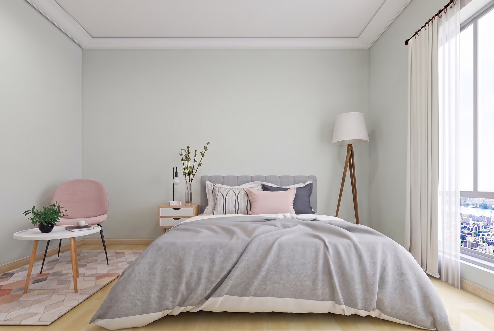
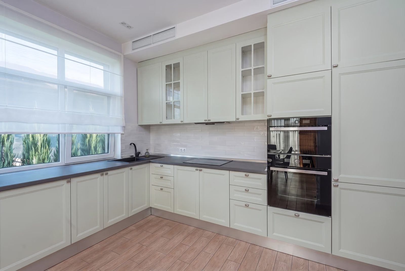

Sherwin-Williams
Sea Salt
SW 6204
Subtle green, a green color
- Color family
- Green
- Sold for
- Interior and exterior
Sherwin-Williams Sea Salt SW 6204 is a light, muted green that can read blue-green. Its LRV of 63 puts it in the light band, bright enough for a whole room. Sherwin-Williams describes it as having blue undertones. Try it in a bathroom, bedroom or laundry room, with a physical sample beside the tile and trim.
Source: Sherwin-Williams's color data. Undertone labels describe our calculation, not the paint formula or a test in your room. How we assess colors.
Is Sea Salt warm or cool? Undertones by the numbers
leans green
Undertone
Subtle green
A gentle lean, quiet on the wall.
Sherwin-Williams describes Sea Salt as a cool, muted green with blue undertones. Our classification places its published swatch in the green category, but that category does not rule out a blue appearance. Cool daylight and contrast with warm beige tile, cream trim or orange-toned wood can make the blue-green side more noticeable. Compare a sample beside those fixed finishes before choosing a trim white.
Sea Salt in different lighting
In south-facing rooms, warm daylight may soften Sea Salt toward sage; cooler north light can emphasize the gray or blue-green side. East-facing rooms may look warmer in the morning and cooler later. In west-facing rooms, compare the cooler morning view with the warmer late-afternoon view, especially beside beige tile or honey-toned wood. Check it again under the lamps you use at night.
Watch for
- Can read pale blue in a north room, especially beside warm beige tile or cream trim
- Can look yellow-green on a sunlit south wall next to honey or orange-toned wood
- Compare morning, afternoon and evening samples before deciding whether the green-blue shift suits the room
Best rooms and surfaces for Sea Salt
Sea Salt is best known as a bathroom color, and it earns that: it is light enough for a small bath with one window, and the gray-green sits easily with white tile, marble and chrome or brushed nickel. Bedrooms and nurseries take it for the same calm reason, and it works in a laundry room, a mudroom and a kitchen behind white cabinets; on the cabinets themselves it gives a pale sage that reads as color in the morning and a soft gray by evening. It falls flat in a room full of warm beige, where tan travertine, cream tile, honey oak or cream trim can push it blue. White oak, pale ash, white quartz and marble suit it.
Sea Salt on an exterior
Sea Salt is rated for exterior use, though it is mostly an interior color. Outdoors it reads lighter and grayer than the chip, and in full sun it can look like a pale silver-green; if you want visible green on siding, sample Comfort Gray SW 6205, the next step down its strip. Spare White SW 6203 trim keeps it soft, Pure White SW 7005 or Extra White SW 7006 give a sharper edge, and Pewter Green SW 6208, Iron Ore SW 7069 or Urbane Bronze SW 7048 all sit well on the door.
Try Sea Salt on your own walls
Upload a photo of your room, or the outside of your house, and TryMyHome renders Sea Salt onto the walls for an illustrative preview beside your floors and furniture. Confirm the color with a physical sample. Your first 3 renders are free.
Sea Salt vs Evergreen Fog, Pure White and Pewter Green
 Evergreen FogSea Salt
Sea Salt vs Evergreen Fog SW 9130
Sea Salt is much lighter; undertone subtle green vs subtle yellow-leaning green. Based on published LRV and our swatch classification.
Evergreen Fog SW 9130 is the mid-depth green people pair with Sea Salt. It is much darker than Sea Salt, and our method calls it a subtle yellow-leaning green where Sea Salt is a subtle green, so Evergreen Fog is warmer and far deeper. Use Sea Salt on walls and Evergreen Fog on an island, vanity or built-ins; pick Evergreen Fog alone for a moody room, Sea Salt alone for a light one.
 Pure WhiteSea Salt
Sea Salt vs Pure White SW 7005
Sea Salt is much darker; undertone subtle green vs faint yellow-beige. Based on published LRV and our swatch classification.
Pure White SW 7005 is the usual white beside Sea Salt. It is much lighter than Sea Salt, and our method gives it a faint yellow-beige undertone: warm, but only just. That small warmth is why it works; a yellower white such as Alabaster SW 7008 can push Sea Salt blue, and Pure White rarely does. Pick Pure White for trim, cabinets and ceilings; pick Sea Salt for the walls between them.
 Pewter GreenSea Salt
Sea Salt vs Pewter Green SW 6208
Sea Salt is much lighter; undertone subtle green vs subtle yellow-leaning green. Based on published LRV and our swatch classification.
Pewter Green SW 6208 is near the dark end of the same fan-deck strip as Sea Salt. It is a deep color where Sea Salt is a light one, and our method reads it as a subtle yellow-leaning green. They are made to go together: Sea Salt walls with a Pewter Green door, island or vanity. Pick Pewter Green alone for a study or front door; pick Sea Salt where the green should stay light.
Questions about Sea Salt
Is Sea Salt blue or green?
Sea Salt is a muted green that can look blue-green. Sherwin-Williams describes blue undertones, and its appearance varies with light and nearby finishes. Check a physical sample beside your tile, flooring and trim; the green label in our calculation does not guarantee a green-looking wall.
What colors go with Sea Salt?
Spare White SW 6203 is the trim white Sherwin-Williams pairs with it, and Pure White SW 7005 is the usual crisper choice. White oak, pale ash, white tile, marble and chrome all sit well with it; warm beige and cream finishes can push it blue.
What is one shade darker than Sea Salt?
Comfort Gray SW 6205 is the next color down on the fan-deck strip; Sea Salt is the lightest color on its strip. To go lighter instead, Kingston SW 9677 is a similar color that sits a step lighter.
Is Sea Salt a good bathroom color?
It can work well in a bathroom with white tile, marble or chrome, where a light gray-green wall gives gentle contrast. Warm beige or cream tile may make the blue-green side more noticeable. Sample it next to the tile and under the vanity lights first.
Is Sea Salt good for exteriors?
It can be, though it is mostly an interior color. Sea Salt is rated for exterior use, and outdoors it reads lighter and grayer. For a house with visible green, sample Comfort Gray SW 6205 beside it. Spare White SW 6203 or Pure White SW 7005 trim and a Pewter Green SW 6208 door are natural pairings.
Get a sample before you paint
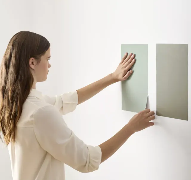
Use the visualizer to narrow your shortlist, then confirm the finalist on your actual wall. A peel-and-stick sample of Sea Salt, checked in morning and evening light, is the last step before a gallon.
- Made with real paint
- Delivered next day
- Peels off clean
 4.8 · 1,842 reviews

Trim, ceiling and coordinating colors for Sea Salt
Sherwin-Williams names Spare White SW 6203 as the trim and ceiling white for Sea Salt, a soft white that keeps the contrast gentle without a hard line. Pure White SW 7005 is the usual crisper pick and stays neutral enough, and Extra White SW 7006 works too; its faint green lean agrees with the walls. The one to be careful with is Alabaster SW 7008, whose warmth can make Sea Salt look bluer. Use the trim white in flat on the ceiling.
Colors darker than Sea Salt
Colors similar to Sea Salt
Closest matches for Sea Salt in other brands
These are the closest digital colors in our catalog, not equivalent paint formulas or touch-up substitutes. Compare physical samples in the same finish before choosing. See the comparison method.