Iron Ore
SW 7069 · Sherwin-Williams

Sherwin-Williams
Iron Ore
SW 7069
No distinct lean, no distinct lean in this calculation
- Color family
- Neutral
- Sold for
- Interior and exterior
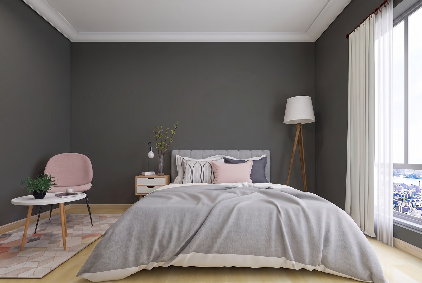
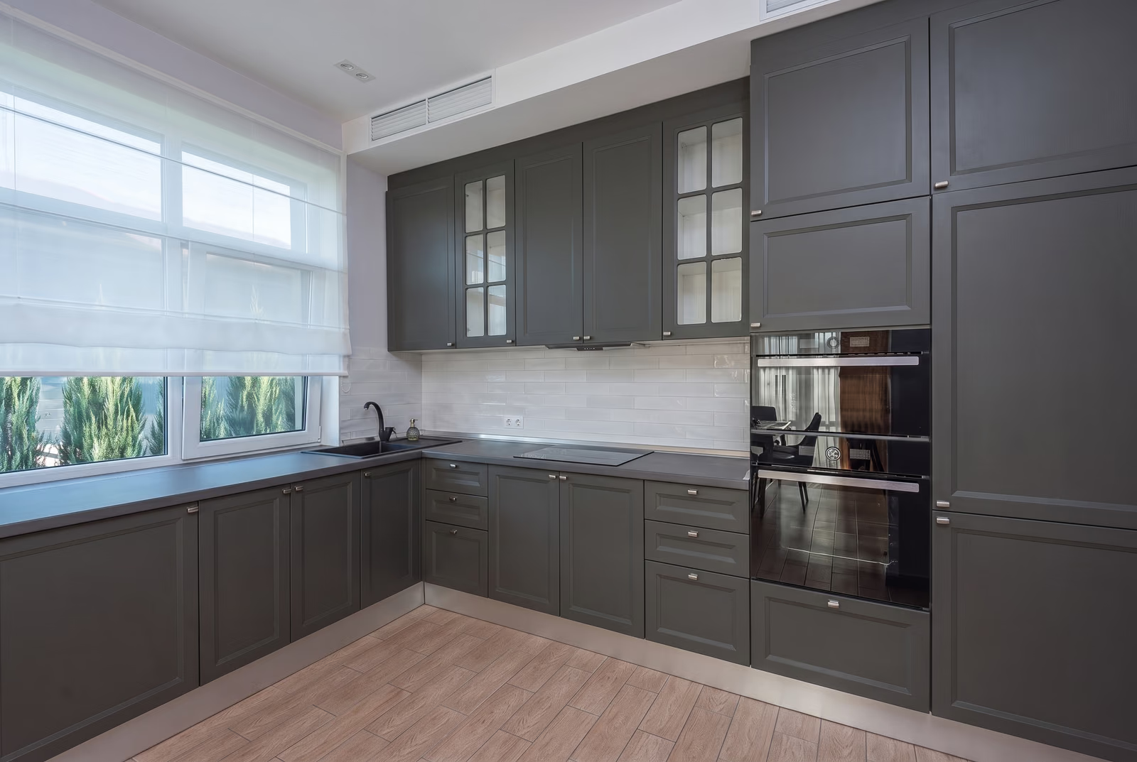
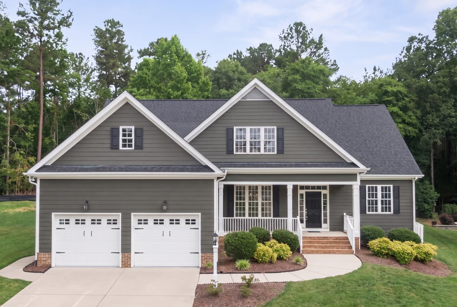
Sherwin-Williams Iron Ore SW 7069 is a very dark charcoal gray from the neutral family. Its LRV of 6 puts it close to black, though on a wall it reads as a soft charcoal rather than a true black. The undertone is neutral, with almost no measurable color. It works on exteriors, front doors, cabinets and accent walls inside.
Source: Sherwin-Williams's color data. Undertone labels describe our calculation, not the paint formula or a test in your room. How we assess colors.
Is Iron Ore warm or cool? Undertones by the numbers
too close to gray to lean
Undertone
No distinct lean
A true neutral, no lean at all.
Iron Ore falls in our lowest-chroma category, with a faint yellow-green trace in the published coordinates. That makes it a near-neutral in this calculation, not a guarantee of no visible undertone. It pairs with warm whites, cool whites, wood, brick and stone without a fight. What people notice instead is how soft it is: a charcoal, not a black, lighter and grayer than Tricorn Black SW 6258. A green-gray or blue-gray appearance cannot be attributed to reflected light alone from these data; sample it beside your trim and flooring in the intended finish.
Iron Ore in different lighting
Iron Ore cares less about which way the window faces and more about how much light comes through: with no undertone to flip, the exposure changes how black it looks, not what color it looks. In a bright south or west room it stays a soft charcoal all day; in a north room or one with a small window it closes up toward black, so give it daylight or warm white bulbs if you chose it for its softness.
Watch for
- In a dim north room it loses its gray and reads as plain black.
- Direct sun across a dark wall shows roller marks and touch-ups, so cut in with care.
- Under cool white bulbs it looks cooler and harder; warm white bulbs keep it charcoal.
Best rooms and surfaces for Iron Ore
Iron Ore is easiest to live with on things rather than on every wall: kitchen islands, lower cabinets, interior doors, a fireplace surround and built-ins, where it reads as a soft black that does not fight the room. As a wall color it does its best work in a bedroom, study, powder room or dining room, paired with light floors so the room keeps some bounce. It falls flat in a dim hallway or a windowless room, where the charcoal softness disappears into a black that shows every scuff. It sits well with white oak, walnut and medium brown floors, white or light gray quartz, marble and brick; against Alabaster SW 7008 it looks warmer and softer, against Extra White SW 7006 crisper and blacker.
Iron Ore on an exterior
Iron Ore sits in the Top Exterior Colors collection. Outdoors, in full sun, it reads lighter and grayer than the chip, so siding or board and batten in it looks charcoal rather than black. Extra White SW 7006 trim gives the sharpest contrast and Nebulous White SW 7063 a quieter one; for the door, Tricorn Black SW 6258 goes a step darker, or use Iron Ore itself in a higher sheen. Dark paint absorbs heat, so check that vinyl siding is rated for it.
Try Iron Ore on your own walls
Upload a photo of your room, or the outside of your house, and TryMyHome renders Iron Ore onto the walls for an illustrative preview beside your floors and furniture. Confirm the color with a physical sample. Your first 3 renders are free.
Iron Ore vs Tricorn Black, Urbane Bronze and Pewter Green
 Tricorn BlackIron Ore
Iron Ore vs Tricorn Black SW 6258
Iron Ore is a touch lighter; both fall in our no distinct lean category. Based on published LRV and our swatch classification.
Both measure in our lowest-chroma category, so the difference is depth. Iron Ore gives back about twice the light of Tricorn Black SW 6258. On a wall that gap is the difference between black and charcoal. Pick Tricorn Black for a real black on doors, window frames and a modern exterior. Pick Iron Ore when you want the dark look with softer edges, especially in rooms with less light, where Tricorn Black can go flat.
 Urbane BronzeIron Ore
Iron Ore vs Urbane Bronze SW 7048
Iron Ore is a touch darker; undertone no distinct lean vs subtle yellow-brown. Based on published LRV and our swatch classification.
Urbane Bronze SW 7048 is a touch lighter and carries a subtle yellow-brown undertone, so it reads as a warm brown-gray. Iron Ore has no measurable undertone and reads as charcoal. Pick Urbane Bronze for a house with warm stone, brick or cedar, where a neutral charcoal can look cold by contrast. Pick Iron Ore when the rest of the palette is white, gray or black and you want it to stay neutral.
 Pewter GreenIron Ore
Iron Ore vs Pewter Green SW 6208
Iron Ore is noticeably darker; undertone no distinct lean vs subtle yellow-leaning green. Based on published LRV and our swatch classification.
Pewter Green SW 6208 is a dark green-gray, about twice as light as Iron Ore, with a subtle yellow-leaning green undertone that shows in daylight. Iron Ore stays gray. Both work on cabinets, doors and exteriors. Pick Pewter Green if you want the room to read as a color. Pick Iron Ore if you want dark without committing to green.
Questions about Iron Ore
Is Iron Ore black or gray?
Iron Ore is a very dark gray that reads as a soft black. Tricorn Black SW 6258, a true black, is a touch darker still. In good light you can see the gray in it; in a dim room it looks black. Most people describe it as charcoal.
What colors go with Iron Ore?
Sherwin-Williams suggests Nebulous White SW 7063 for trim and ceilings; Extra White SW 7006 is the crispest choice, and with no undertone to clash, any white works. It also sits well with white oak, walnut and medium brown floors, white or light gray quartz, marble and brick.
What is one shade lighter than Iron Ore?
Iron Ore is the lightest color on its own fan-deck strip; every step there goes darker, down to Tricorn Black SW 6258. For lighter, its close match Black Fox SW 7020 is a touch lighter and Urbane Bronze SW 7048 the next step up.
Is Iron Ore good for exteriors?
Yes. Sherwin-Williams lists it for interior and exterior use and includes it in the Top Exterior Colors collection. Outdoors it reads lighter and grayer than indoors, which is why whole houses in Iron Ore look charcoal rather than black. Check that vinyl siding is rated for dark colors before you paint it.
Get a sample before you paint
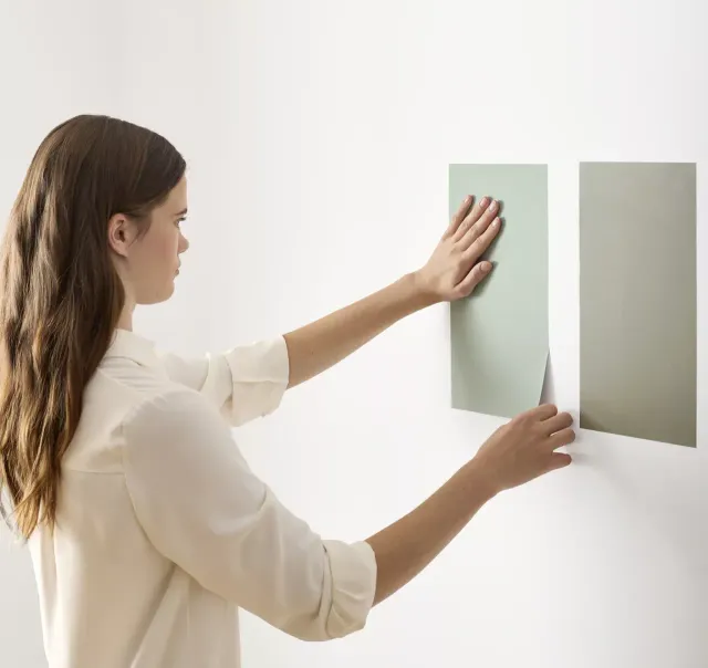
Use the visualizer to narrow your shortlist, then confirm the finalist on your actual wall. A peel-and-stick sample of Iron Ore, checked in morning and evening light, is the last step before a gallon.
- Made with real paint
- Delivered next day
- Peels off clean
 4.8 · 1,842 reviews

Trim, ceiling and coordinating colors for Iron Ore
Sherwin-Williams pairs Iron Ore with Nebulous White SW 7063, a soft gray-white that keeps the contrast gentle. Extra White SW 7006 is the crispest option against dark walls, and Pure White SW 7005 sits between the two. Because Iron Ore has no undertone, any of these looks right; pick by contrast. Paint the ceiling in the same white as the trim, in a flat finish, so a dark room keeps one bright surface.
Colors darker than Iron Ore
Colors similar to Iron Ore
Closest matches for Iron Ore in other brands
These are the closest digital colors in our catalog, not equivalent paint formulas or touch-up substitutes. Compare physical samples in the same finish before choosing. See the comparison method.