Alabaster
SW 7008 · Sherwin-Williams

Sherwin-Williams
Alabaster
SW 7008
Subtle yellow-beige, a warm color
- Color family
- White
- Sold for
- Interior and exterior
Sherwin-Williams Alabaster SW 7008 is a warm white with a soft cream lean. Its LRV of 82 puts it in the off-white band, light enough to brighten a room but not a stark white. Our method reads it as a subtle yellow-beige, warm without going yellow. It works on walls, cabinets, trim and exteriors, often all at once.
Is Alabaster warm or cool? Undertones by the numbers
leans yellow
Undertone
Subtle yellow-beige
A gentle lean, quiet on the wall.
Alabaster has a small, clear lean toward yellow: enough to take the chill off a white, not enough to read as cream on a chip. There is no pink or peach in it; the yellow tips a hair toward green-yellow, so it does not go rosy. What you see depends on the white next to it: against a clean white such as Extra White SW 7006 or a cool white quartz it can look distinctly yellow, the most common complaint about it, while against wood, stone and warm fabrics it reads as a soft white. Treat it as a white that wants warm company.
Alabaster in north, south, east and west light
North rooms are where Alabaster earns its keep: the yellow is just enough to stop the wall going the gray-blue that bright whites turn in north light, so it reads as a calm, soft white. South rooms are the ones to watch, since strong afternoon sun can make it look creamy, especially against a cooler white trim or counter.
Watch for
- Can look creamy or yellow on a sunlit south wall beside a cool white counter
- Can read faintly yellow next to Extra White SW 7006 or any brighter, cleaner white
- Can look dull beside stark white tile, white appliances or bright white quartz
Best rooms and surfaces for Alabaster
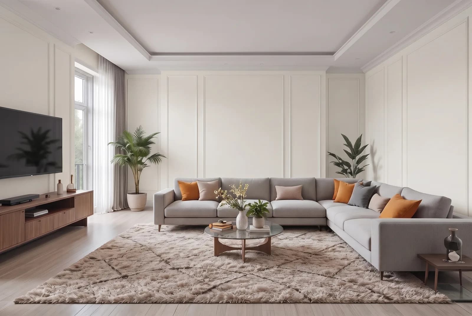
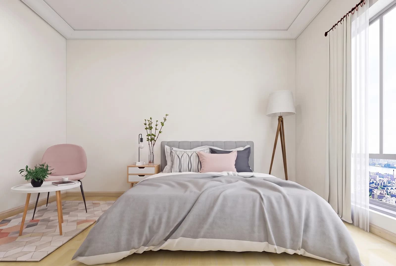
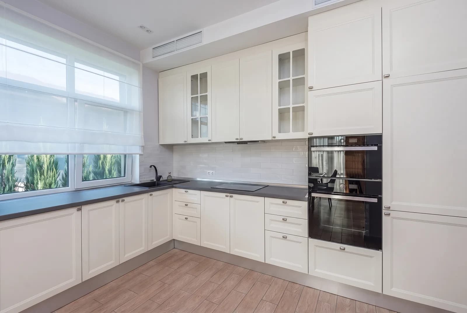
Alabaster is the default white for people who find bright white cold: bright enough for every wall in a house, and a common kitchen cabinet color because it reads white on the doors but stays warm beside wood floors and brass or black hardware. It also makes a good trim and ceiling white for warmer wall colors like Accessible Beige SW 7036 and Natural Linen SW 9109. It falls flat beside a cleaner white: next to Extra White SW 7006 trim, stark white tile or bright white quartz the walls can look yellow, so keep the room's whites close in brightness or make Alabaster the brightest one present. It sits well with white oak, walnut, warm-veined marble and cream or greige quartz.
Alabaster on an exterior
Alabaster is the white behind a great many white houses, and Sherwin-Williams lists it among its top exterior colors. Outdoors it reads lighter than the chip: full sun washes out most of its warmth, so on siding it looks like a clean white, and in shade and at dusk the warmth returns. Use Pure White SW 7005 trim for a slightly brighter edge or Alabaster itself for a single-color house; on doors and shutters, Tricorn Black SW 6258, Iron Ore SW 7069, Urbane Bronze SW 7048 and Pewter Green SW 6208 all sit well against it.
Try Alabaster on your own walls
Upload a photo of your room, or the outside of your house, and TryMyHome renders Alabaster onto the walls so you can judge it in your light, with your floors and furniture. Your first five renders are free.


Trusted by 19,897+ happy homeowners
Alabaster vs Greek Villa, Shoji White, Pure White and Snowbound
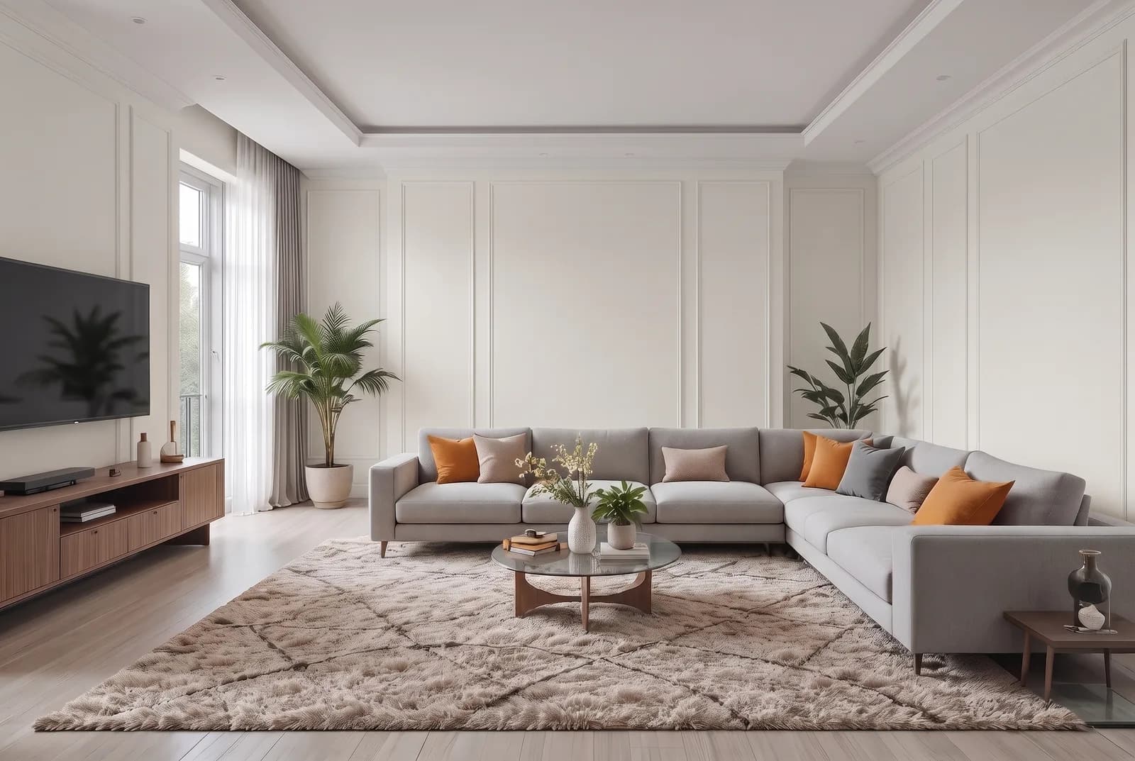 Greek VillaAlabaster
Alabaster vs Greek Villa SW 7551
Alabaster is a touch darker; both have a subtle yellow-beige undertone.
Greek Villa SW 7551 is nearly identical to Alabaster on a wall; most people cannot tell them apart. It is a touch lighter, and both carry the subtle yellow-beige label. Pick Greek Villa for a slightly brighter, softer white; pick Alabaster if you want a hair more body against bright trim. Do not use them together; they are too close.
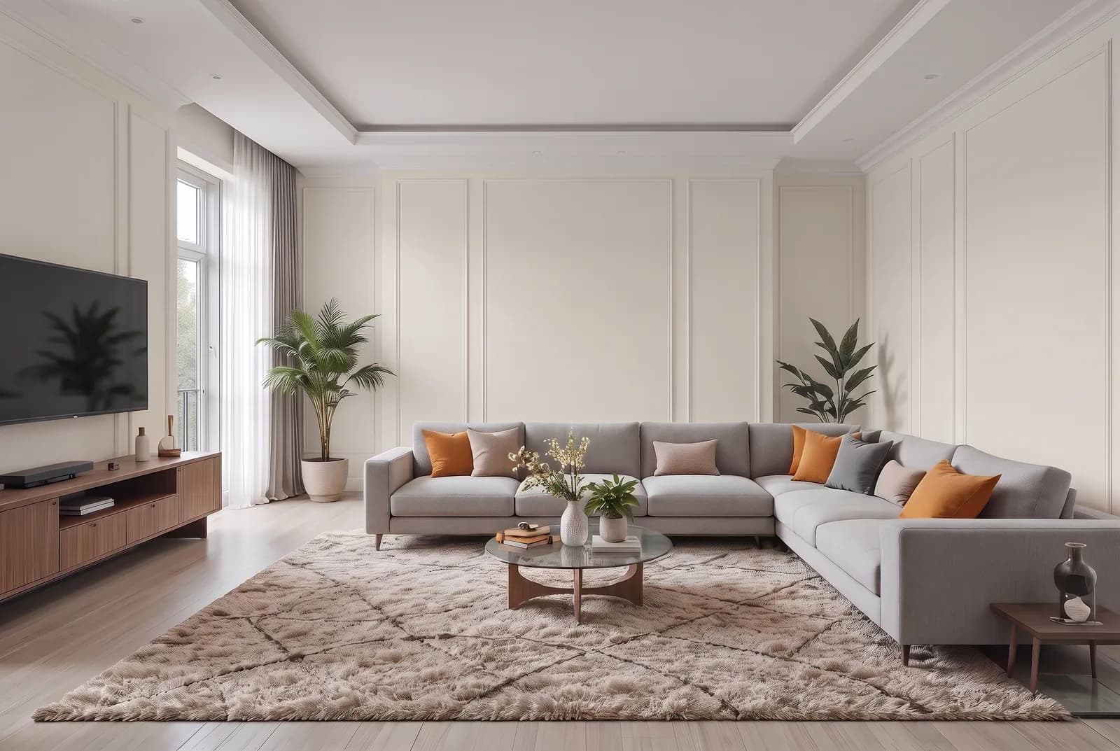 Shoji WhiteAlabaster
Alabaster vs Shoji White SW 7042
Alabaster is noticeably lighter; both have a subtle yellow-beige undertone.
Shoji White SW 7042 is the quieter, more shadowed of the two. It sits a step darker than Alabaster (LRV 74 against 82) with the same subtle yellow-beige undertone, so the difference on a wall is depth, not color: Alabaster keeps reading as a bright warm white while Shoji White settles toward a soft off-white. In a dim or north room Shoji White can tip beige where Alabaster holds its white look. They also pair well, Shoji White walls under Alabaster trim and ceiling. Pick Alabaster for the brighter room; pick Shoji White when plain white walls feel stark.
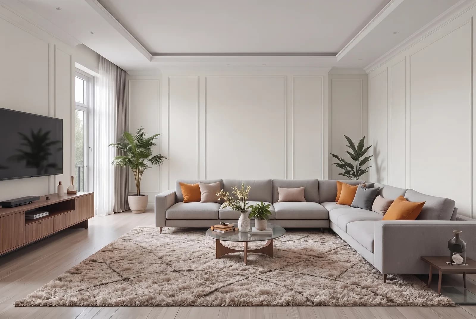 Pure WhiteAlabaster
Alabaster vs Pure White SW 7005
Alabaster is a touch darker; undertone subtle yellow-beige vs faint yellow-beige.
Pure White SW 7005 is the cleaner white. It is a touch lighter than Alabaster, and our method rates its undertone as faint rather than subtle, so it has less yellow. Side by side, Pure White looks like white and Alabaster looks like warm white. The common split is Alabaster on walls or cabinets with Pure White on trim. Pick Pure White alone for a brighter, more neutral room; pick Alabaster alone where you want warmth.
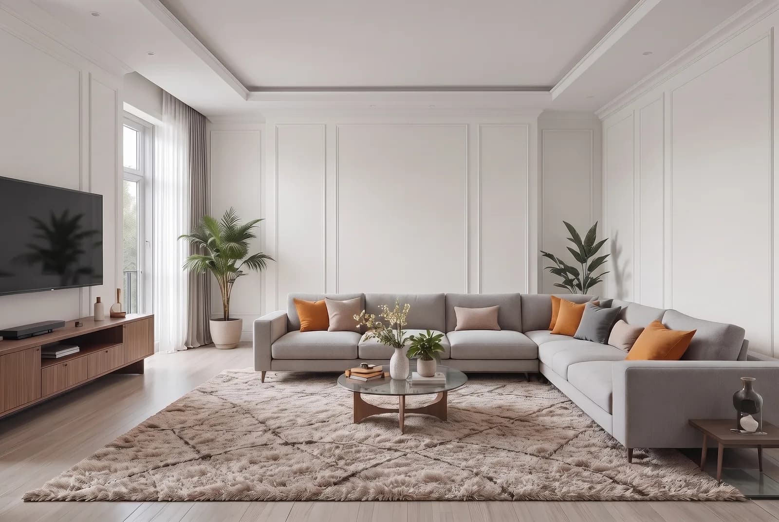 SnowboundAlabaster
Alabaster vs Snowbound SW 7004
Alabaster is a touch darker; undertone subtle yellow-beige vs faint yellow-beige.
Snowbound SW 7004 sits at almost the same depth as Alabaster, so the difference is all undertone. Our method gives Snowbound a faint yellow-beige and Alabaster a subtle one, which means Snowbound carries less warmth and reads cleaner and cooler beside it. Pick Snowbound for a white that stays quiet next to gray tile, cool quartz or black window frames; pick Alabaster where wood, brass and warm stone need a white that joins in.
Questions about Alabaster
Does Alabaster look yellow?
It can, by contrast. Alabaster on its own reads as a soft white, but beside a cleaner white such as Extra White SW 7006, bright white tile or a cool white quartz, its yellow shows and it can look creamy. Keep the other whites in the room warm or slightly darker and it stays white.
What colors go with Alabaster?
For trim, the usual choice is Alabaster itself in a higher sheen, or Pure White SW 7005 for a slightly brighter edge that stays neutral. It also sits well with white oak, walnut, warm-veined marble and cream or greige quartz, and a door in Tricorn Black SW 6258 or Iron Ore SW 7069.
What is one shade lighter than Alabaster?
Pure White SW 7005 is one step lighter on Alabaster's own strip, and Greek Villa SW 7551 is a touch lighter as well. The next step darker on the strip, Egret White SW 7570, is a much bigger drop.
Is Alabaster good for kitchen cabinets?
Yes, it is a common cabinet color: it reads white on the doors but stays warm beside wood floors and brass or black hardware. Keep the room's other whites close to it in brightness, since bright white quartz or tile can make it look yellow.
Is Alabaster good for exteriors?
Yes. Alabaster is rated for exterior use and Sherwin-Williams lists it among its top exterior colors. In full sun it reads as a clean, bright white, with its warmth showing only in shade. Pure White SW 7005 trim and a Tricorn Black SW 6258 or Iron Ore SW 7069 door are common pairings.
Get a sample before you paint
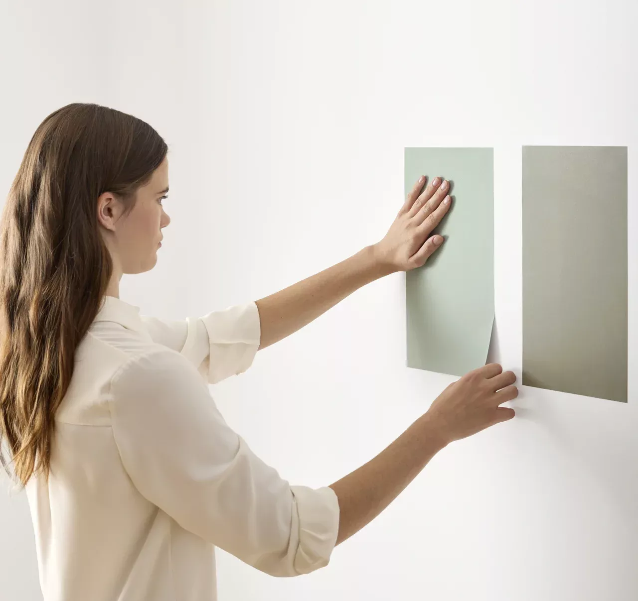
Use the visualizer to narrow your shortlist, then confirm the finalist on your actual wall. A peel-and-stick sample of Alabaster, checked in morning and evening light, is the last step before a gallon.
- Made with real paint
- Delivered next day
- Peels off clean
 4.8 · 1,842 reviews