On the Rocks
SW 7671 · Sherwin-Williams


Sherwin-Williams
On the Rocks
SW 7671
Faint yellow-beige, a very subtle lean
- Color family
- White
- Sold for
- Interior and exterior
Sherwin-Williams On the Rocks SW 7671 is a light gray with little warmth, the cool sibling of Agreeable Gray SW 7029 at the same depth. Its LRV of 62 is light enough for a whole house, yet deep enough to read as a true gray against white trim. Our method reads it as neutral, with a faint yellow-beige lean that keeps it just off cold. It is the gray for people who found the greiges too beige.
Source: Sherwin-Williams's color data. Undertone labels describe our calculation, not the paint formula or a test in your room. How we assess colors.
Is On the Rocks warm or cool? Undertones by the numbers
too close to gray to lean
Undertone
Faint yellow-beige
Barely off gray.
On the Rocks has a faint yellow-green lean in our swatch calculation, which does not rule out a blue-gray appearance on a wall. That is as close to a plain gray as a Sherwin-Williams wall color gets while staying off cold. Beside Extra White SW 7006 trim it reads as a clean light gray. Beside a warm white such as Greek Villa SW 7551, its listed accent, the green tilt can show and it looks a hair sage. Warm oak makes it look cooler and bluer by contrast; gray tile makes it look warmer. Agreeable Gray SW 7029 and Repose Gray SW 7015 both carry visible beige next to it. Big Chill SW 7648 is its twin, so close that the two chips look identical.
On the Rocks in different lighting
On the Rocks is a safe gray for a north-facing room. Cool light makes it a shade darker and a shade cooler. It reads as a clean pale gray rather than the muddy greige a warm gray turns into there. Do not expect warmth from it in a north room; it has none to give, so the floor and the furniture have to supply it. South light lifts it and adds a whisper of beige. East and west rooms barely change it. Bulbs decide the rest: 2700K warms it toward greige, 3000K keeps it the gray on the chip, and 4000K turns it steel.
Watch for
- May look steely blue-gray under cooler lamps, especially beside warm finishes
- Beside a warm white such as Greek Villa SW 7551 it can look a hair green
- Against orange-toned oak it looks cold and blue by contrast
Best rooms and surfaces for On the Rocks
On the Rocks is a whole-house gray for a house with white trim, black metal and floors that are not orange. It is light enough for a hallway and dark enough that a living room wall reads as gray, not white. It suits white oak, gray-washed wood, marble and cool tile, and it is the wall behind white cabinets in a modern kitchen. As a cabinet color it reads as a plain light gray and needs a bright white wall such as Extra White SW 7006. It works in a bathroom under cool LEDs, where warm grays fail. Bedrooms take it with white bedding and a warm rug. Against cream trim or beige tile it looks cold; there Agreeable Gray SW 7029 is the better fit.
On the Rocks on an exterior
On the Rocks is sold for exterior use. Outside it reads as a pale gray that stays gray in full sun, where the warm greiges bleach to white. On a shaded wall it deepens toward concrete. It suits a modern house with black windows, a standing-seam roof and a concrete or stone base. Extra White SW 7006 on the trim keeps the lines crisp. A door in Tricorn Black SW 6258, or a natural wood door, gives the front some warmth it lacks on its own.
Try On the Rocks on your own walls
Upload a photo of your room, or the outside of your house, and TryMyHome renders On the Rocks onto the walls for an illustrative preview beside your floors and furniture. Confirm the color with a physical sample. Your first 3 renders are free.
On the Rocks vs Crushed Ice, Agreeable Gray, Big Chill and Repose Gray
 Crushed IceOn the Rocks
On the Rocks vs Crushed Ice SW 7647
On the Rocks is noticeably darker; both fall in our faint yellow-beige category. Based on published LRV and our swatch classification.
Crushed Ice SW 7647 is the next step up the same fan-deck strip, four points lighter at an LRV of 66. It has the same faint neutral lean. The two read as the same gray at two depths. Take Crushed Ice for a small or dim room, or a low ceiling, where On the Rocks would feel heavy. Take On the Rocks for a bright room where the walls should read as a definite gray.
 Agreeable GrayOn the Rocks
On the Rocks vs Agreeable Gray SW 7029
On the Rocks is a touch lighter; undertone faint yellow-beige vs subtle yellow-beige. Based on published LRV and our swatch classification.
Agreeable Gray SW 7029 sits at nearly the same depth, an LRV of 60, but it is warm where On the Rocks is neutral. Side by side Agreeable Gray looks beige and On the Rocks looks gray. Choose Agreeable Gray for warm floors, cream trim and a house that should feel soft. Choose On the Rocks for white trim, black metal, cool tile and a house that should feel clean.
On the Rocks vs Big Chill SW 7648
On the Rocks is a touch darker; both fall in our faint yellow-beige category. Based on published LRV and our swatch classification.
Big Chill SW 7648 is the closest match to On the Rocks in the deck, the same LRV of 62 and the same faint lean. On a wall the two are one color, and the choice comes down to which chip is in your hand. Big Chill sits at the bottom of the strip that runs down from High Reflective White SW 7757. On the Rocks sits near the bottom of the strip below Westhighland White SW 7566. Pick either and do not sample both.
 Repose GrayOn the Rocks
On the Rocks vs Repose Gray SW 7015
On the Rocks is noticeably lighter; undertone faint yellow-beige vs subtle yellow-beige. Based on published LRV and our swatch classification.
Repose Gray SW 7015 is three points darker at an LRV of 58 and carries a small warm lean that On the Rocks lacks. On a wall Repose Gray reads as a soft warm gray with a little more weight; On the Rocks reads as a cleaner, cooler gray. Repose Gray is the pick for a room with beige stone or warm wood. On the Rocks is the pick for white, black and marble.
Questions about On the Rocks
Does On the Rocks look blue or green?
On the Rocks can appear blue-gray in some rooms, even though our swatch calculation gives it a faint yellow-green lean. In practice it looks blue under 4000K bulbs and against orange oak, both by contrast. It can look a hair green beside a warm white such as Greek Villa SW 7551. Under 3000K bulbs with white trim it reads as a plain light gray.
What colors go with On the Rocks?
Sherwin-Williams lists Extra White SW 7006 for trim and ceilings. Its accents are Greek Villa SW 7551 and Almond Roca SW 9105, a warm white and a caramel brown. Beyond that it suits white oak, marble, black metal and chrome. On an island or a front door, Naval SW 6244 or Iron Ore SW 7069 gives it the depth it lacks on its own.
Is On the Rocks gray or white?
Gray, on any wall. Sherwin-Williams files it in the white family, but at an LRV of 62 it is as deep as Agreeable Gray SW 7029. Against white trim it reads as a light gray. It only looks white in a very bright room next to a darker color. Treat it as a gray when you plan the trim and the floor.
Is On the Rocks good for a living room?
Yes, in a living room with good light and a modern or coastal palette: a white sofa, an oak or gray-washed floor, black frames. It gives the walls a clear gray without the beige that makes some greiges look dated. In a north-facing living room it stays a clean gray but gives no warmth, so bring warmth in with wood and a rug. Trim it in Extra White SW 7006.
What is one shade lighter or darker than On the Rocks?
On its fan-deck strip the next step lighter is Crushed Ice SW 7647, four points up and the same neutral gray. The step darker is Pediment SW 7634, less than a point down and warmer, a greige rather than a gray. Among its closest matches, Big Chill SW 7648 is the twin at the same depth. Repose Gray SW 7015 sits three points darker and warmer.
Get a sample before you paint
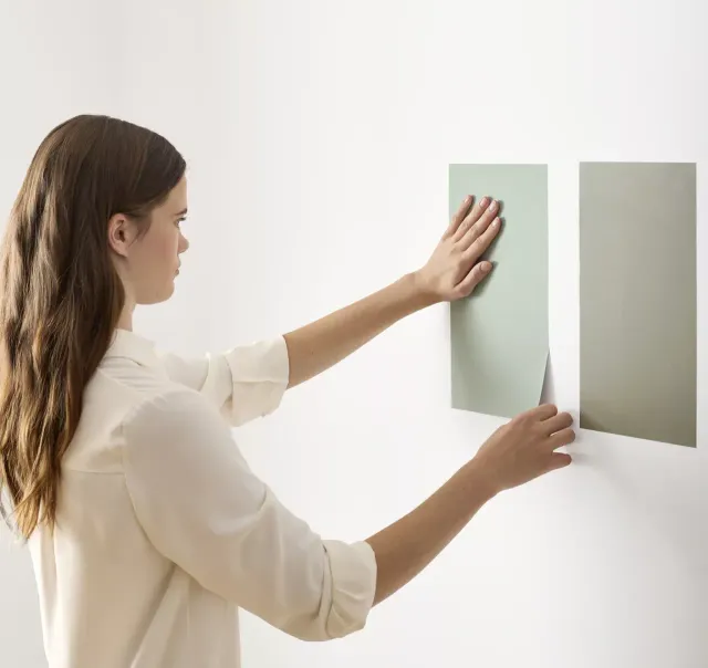
Use the visualizer to narrow your shortlist, then confirm the finalist on your actual wall. A peel-and-stick sample of On the Rocks, checked in morning and evening light, is the last step before a gallon.
- Made with real paint
- Delivered next day
- Peels off clean
 4.8 · 1,842 reviews

Trim, ceiling and coordinating colors for On the Rocks
Sherwin-Williams names Extra White SW 7006 as the trim and ceiling white for On the Rocks, a bright neutral white 24 points up that keeps the gray reading clean. Pure White SW 7005 (84) is a softer option with the same neutral lean. Greek Villa SW 7551 (84.2), its listed accent, is the warm choice and makes the walls read a touch cooler. Avoid creams such as Creamy SW 7012 (81.2), which look yellow beside it.
Colors lighter and darker than On the Rocks
Colors similar to On the Rocks
Closest matches for On the Rocks in other brands
These are the closest digital colors in our catalog, not equivalent paint formulas or touch-up substitutes. Compare physical samples in the same finish before choosing. See the comparison method.