Repose Gray
SW 7015 · Sherwin-Williams
Sherwin-Williams
Repose Gray
SW 7015
Subtle yellow-beige, a warm color
- Color family
- Neutral
- Sold for
- Interior and exterior
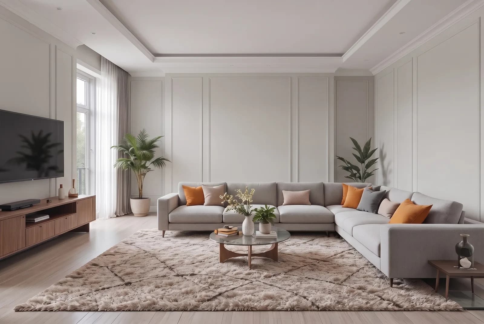
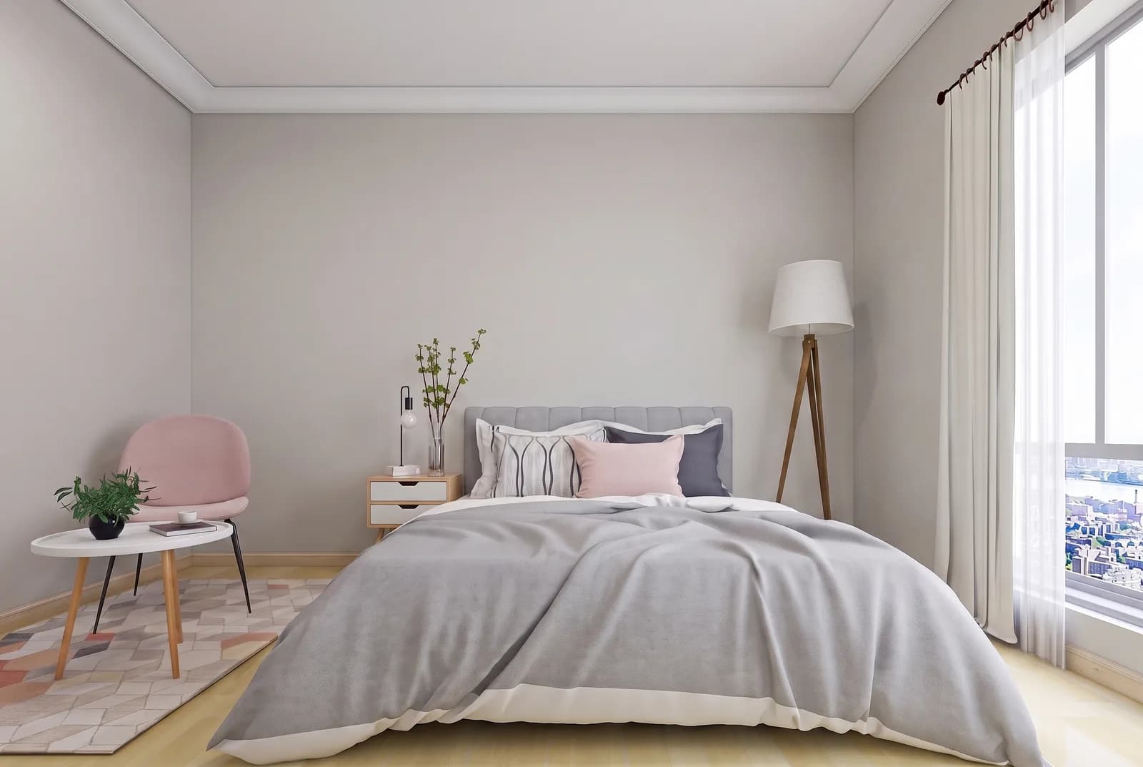
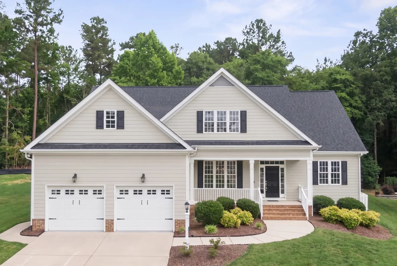
Sherwin-Williams Repose Gray SW 7015 is a light warm gray, often called a greige, from the neutral family. At LRV 58 it is light enough for every wall and still a color against white trim. The undertone is a subtle yellow-beige. It suits living rooms, bedrooms, kitchens and open plans, and is listed for exterior use.
Is Repose Gray warm or cool? Undertones by the numbers
leans yellow
Undertone
Subtle yellow-beige
A gentle lean, quiet on the wall.
Repose Gray measures warm, but only just: its lean sits in the yellow range in an amount our method calls subtle, enough warmth to keep it from looking like a cold concrete gray, not enough to make it a beige. It is widely reported to flash green in some rooms and violet in others; measured, the paint has almost no pull toward either, so the flash is contrast, not pigment. Against a clean white trim and neutral floors it reads as a warm gray and nothing more. Agreeable Gray SW 7029 has a touch more red and is the one to pick if the green flash worries you.
Repose Gray in north, south, east and west light
Repose Gray suits east and north rooms best: the warm lean keeps it from going cold where a cooler gray would, and the lower light keeps it looking gray rather than beige. South rooms with big windows are where to be careful; if the gray matters, sample it against Mindful Gray SW 7016, one step darker on its strip, and keep one warm-white bulb color for the whole space, since mixed light shows the green or violet flash most.
Watch for
- Against orange-toned oak or honey pine it can flash green.
- Against blue tile or navy cabinets it can flash faintly violet.
- In a big south room with white trim the gray can fade toward off-white.
Best rooms and surfaces for Repose Gray
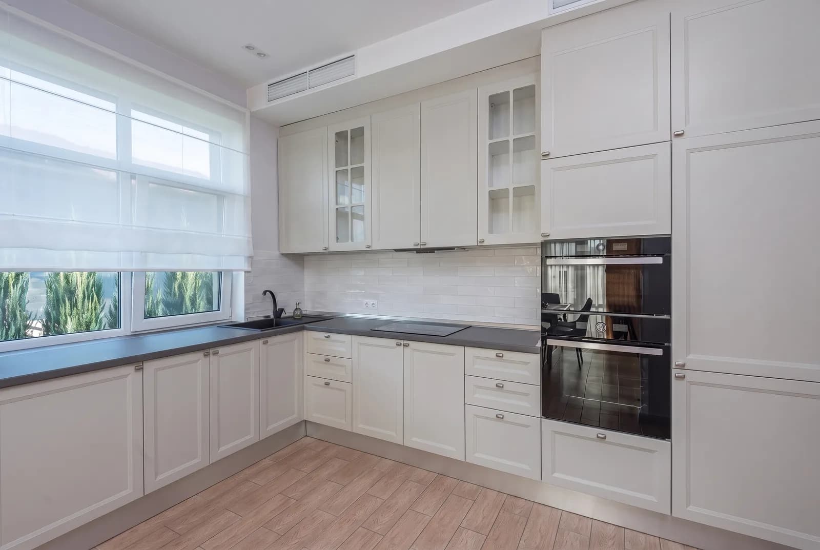
Repose Gray is a whole-house wall color: living rooms, bedrooms, hallways and open kitchens, light enough to repeat from room to room, with just enough warmth to avoid the flat look of a cooler gray. On kitchen cabinets it reads as a soft gray and suits shaker doors with brass or black hardware. It falls flat in a room full of warm beige, where carpet, tile and sofas make it look green and a little dingy, and it loses its gray in a very bright south room with white trim. It sits well with white oak, gray-washed wood and medium walnut, clashes with strongly orange oak, and pairs on doors or an island with Iron Ore SW 7069 or Urbane Bronze SW 7048.
Repose Gray on an exterior
Repose Gray is listed for exterior use and sits in the Top Exterior Colors collection. Outdoors it reads lighter and flatter than inside, more a pale warm gray than a greige, so on siding it gives a soft look. Use a white trim with a clear gap, Extra White SW 7006 or Pure White SW 7005, or the coordinating Eider White SW 7014 for less contrast; for a door, Iron Ore SW 7069, Tricorn Black SW 6258 and Urbane Bronze SW 7048 all hold up against it.
Try Repose Gray on your own walls
Upload a photo of your room, or the outside of your house, and TryMyHome renders Repose Gray onto the walls so you can judge it in your light, with your floors and furniture. Your first five renders are free.


Trusted by 19,897+ happy homeowners
Repose Gray vs Agreeable Gray, Drift of Mist and Accessible Beige
 Agreeable GrayRepose Gray
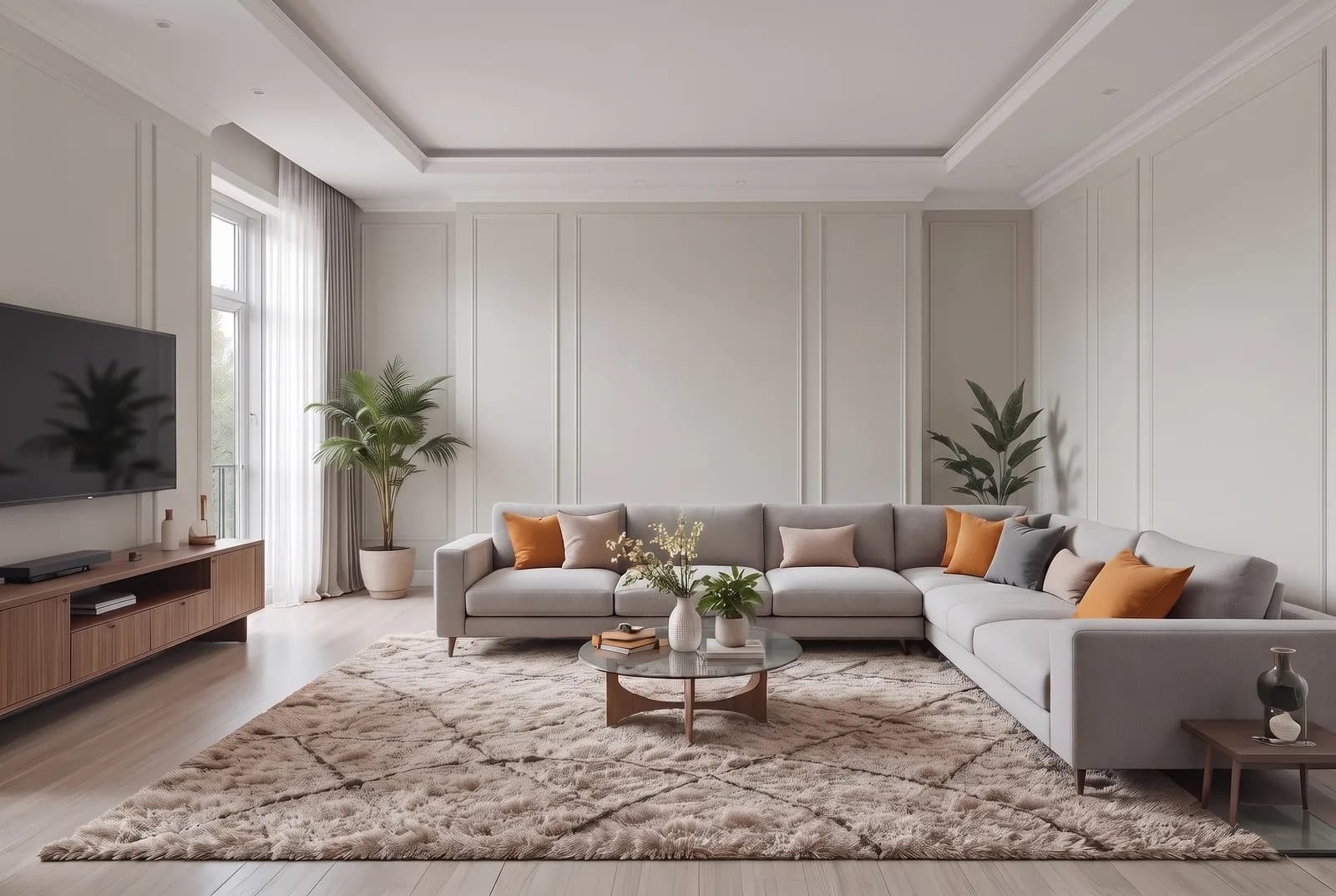
Repose Gray vs Agreeable Gray SW 7029
Repose Gray is a touch darker; both have a subtle yellow-beige undertone.
Agreeable Gray SW 7029 is very close to Repose Gray, a close sibling, and a touch lighter. Both carry a subtle yellow-beige undertone, but Agreeable Gray has a touch more red in its mix (#D1CBC1 against #CCC9C0), so it reads a step warmer and more beige, while Repose Gray reads grayer. Pick Agreeable Gray for a room with cool light or cool finishes. Pick Repose Gray if you want the walls to read as gray first.
 Drift of MistRepose Gray
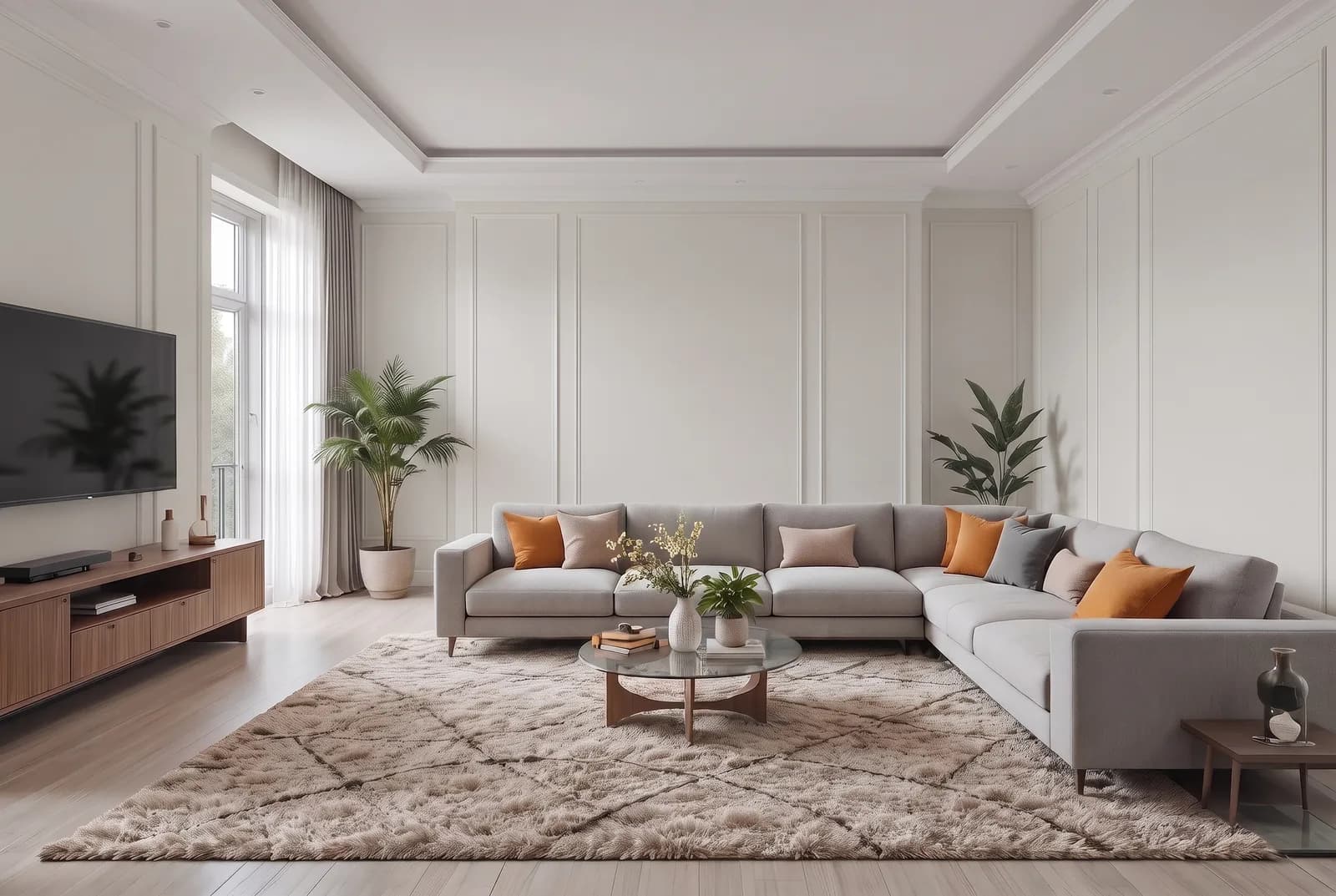
Repose Gray vs Drift of Mist SW 9166
Repose Gray is much darker; both have a subtle yellow-beige undertone.
Drift of Mist SW 9166 is the same kind of color, a subtle yellow-beige neutral, but much lighter. That is the difference between a color and a tinted white. Pick Drift of Mist for a dark hallway, a small north room, or as the lighter partner to Repose Gray in an open plan. Pick Repose Gray where you want the walls to show as gray against white trim.
 Accessible BeigeRepose Gray
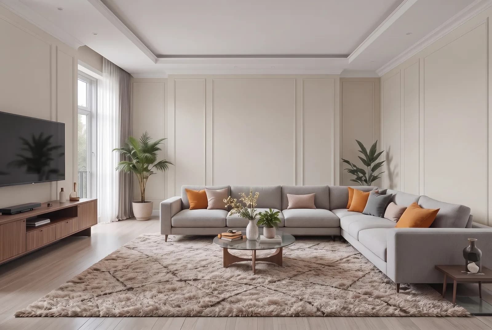
Repose Gray vs Accessible Beige SW 7036
Repose Gray is a touch lighter; undertone subtle yellow-beige vs noticeable yellow-beige.
Accessible Beige SW 7036 sits at almost the same brightness as Repose Gray, so the choice is about undertone. Accessible Beige has a noticeable yellow-beige undertone and reads as a beige; Repose Gray's undertone is subtle and it reads as a gray. Pick Accessible Beige for a house with warm wood, brick and brown furniture. Pick Repose Gray for a cleaner look with white, black and lighter wood.
Questions about Repose Gray
Does Repose Gray look green or purple?
It can. Repose Gray is widely reported to flash green next to warm orange wood or beige, and faintly violet next to blue. Measured, the paint has almost no pull toward either green or violet, so neither lean is strong in the paint; it is the room adding the color. Sample it next to your floor and furniture.
Is Repose Gray a greige?
Yes, in the everyday sense. It is a gray with a subtle yellow-beige undertone, enough warmth to keep it off cold concrete gray, not enough to make it a beige. Next to a true beige such as Accessible Beige SW 7036 it reads as a gray.
What colors go with Repose Gray?
For trim, Sherwin-Williams pairs it with Eider White SW 7014; Extra White SW 7006 or Pure White SW 7005 read more clearly as white. It sits well with white oak and medium walnut, and with Iron Ore SW 7069 or Urbane Bronze SW 7048 on doors or an island.
What is one shade lighter than Repose Gray?
Repose Gray is the lightest color on its own strip, so the fan deck offers no lighter step there; Agreeable Gray SW 7029 is a touch lighter and Drift of Mist SW 9166 much lighter. One shade darker on the strip is Mindful Gray SW 7016.
Is Repose Gray a good whole-house color?
Yes, that is its main use: living rooms, bedrooms, hallways and open kitchens, light enough to repeat from room to room with enough warmth to avoid a flat look. In a very bright south room with white trim it can fade toward off-white.
Get a sample before you paint
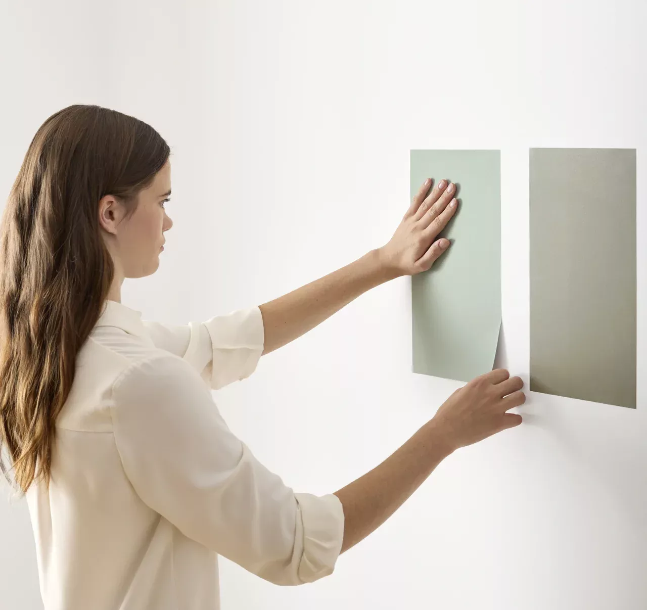
Use the visualizer to narrow your shortlist, then confirm the finalist on your actual wall. A peel-and-stick sample of Repose Gray, checked in morning and evening light, is the last step before a gallon.
- Made with real paint
- Delivered next day
- Peels off clean
 4.8 · 1,842 reviews