Drift of Mist
SW 9166 · Sherwin-Williams



Sherwin-Williams
Drift of Mist
SW 9166
Subtle yellow-beige, a warm color
- Color family
- Neutral
- Sold for
- Interior and exterior
Sherwin-Williams Drift of Mist SW 9166 is a light warm gray, close to an off-white, with a subtle yellow-beige undertone. Its LRV of 69 is light, a shade below the off-whites. It works as a whole-house wall color, in living rooms, bedrooms, and hallways, and on exteriors.
Is Drift of Mist warm or cool? Undertones by the numbers
leans yellow
Undertone
Subtle yellow-beige
A gentle lean, quiet on the wall.
Drift of Mist is a warm gray with very little else in it: no measurable pull toward red or green, only a small, faint pull toward yellow, so there is little for a change of light to work on. On a wall it reads as a soft gray-white, gray next to a bright white and white next to a mid-tone like Repose Gray SW 7015; the warmth is mild enough that it does not turn beige the way Accessible Beige SW 7036 does. Its closest match in the deck is City Loft SW 7631, a touch lighter and warmer, hard to tell apart on a wall.
Drift of Mist in north, south, east and west light
Drift of Mist is forgiving of exposure because there is so little in it for the light to change: the swing is between a slightly grayer version and a slightly creamier one, and its warmth keeps north and east rooms from feeling cold. The exposure to watch is a strong south or west room with a lot of direct sun, where it can wash out and merge with a warm white trim.
Watch for
- Bright south rooms with warm white trim: wall and trim can merge into one color.
- Next to a crisp cool white, it reads grayer and a little darker than the chip.
- Rooms with a lot of orange-toned wood can push the yellow side toward beige.
Best rooms and surfaces for Drift of Mist
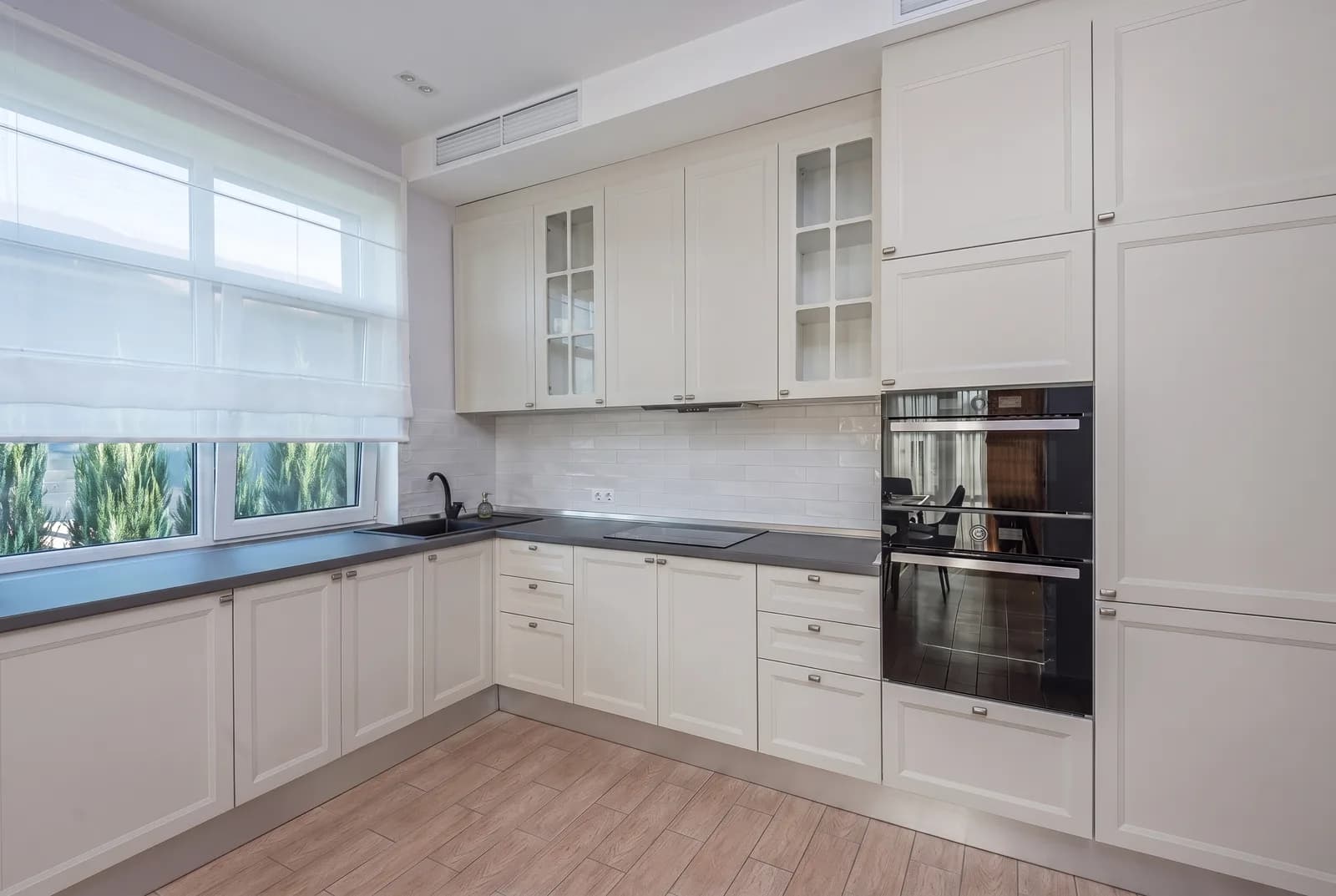
Drift of Mist is a whole-house color: living rooms, bedrooms, hallways, stairwells and open plans. It is light enough for a small bedroom or a windowless hallway, and the gray in it keeps a big living room from looking like an unpainted drywall white. On cabinets it makes a soft gray kitchen; a darker island in Urbane Bronze SW 7048 or Pewter Green SW 6208 gives a clear step. It falls flat as a trim color against a bright white wall, where it reads as a dirty white, and cool blue-grays make its warmth look beige. White oak, gray-washed hardwood, pale limestone, white quartz, brass and black window frames all sit well with it.
Drift of Mist on an exterior
Drift of Mist is listed by Sherwin-Williams among its top exterior colors, and outside it can read lighter than the chip, closer to a warm white than a gray: a softer look on siding than a bright white. Eider White SW 7014 trim gives a quiet, near-matching scheme; Extra White SW 7006 a clear edge. For the front door, Urbane Bronze SW 7048, Iron Ore SW 7069 or Tricorn Black SW 6258 all give a dark contrast; Perle Noir SW 9154 is the dark accent Sherwin-Williams suggests.
Try Drift of Mist on your own walls
Upload a photo of your room, or the outside of your house, and TryMyHome renders Drift of Mist onto the walls so you can judge it in your light, with your floors and furniture. Your first five renders are free.


Trusted by 19,897+ happy homeowners
Drift of Mist vs Agreeable Gray, City Loft, Alabaster and Repose Gray
 Agreeable GrayDrift of Mist
Drift of Mist vs Agreeable Gray SW 7029
Drift of Mist is noticeably lighter; both have a subtle yellow-beige undertone.
Agreeable Gray SW 7029 is a warm gray with the same subtle yellow-beige lean, noticeably darker than Drift of Mist. The two can run together in one house: Agreeable Gray on the main walls and Drift of Mist where you want the same tone lighter. Pick Agreeable Gray when you want a gray that holds its own against white trim. Pick Drift of Mist when Agreeable Gray feels a shade too dark for the room.
 City LoftDrift of Mist
Drift of Mist vs City Loft SW 7631
Drift of Mist is a touch darker; both have a subtle yellow-beige undertone.
City Loft SW 7631 is the closest color in the deck to Drift of Mist; the two are near twins, hard to tell apart on a wall. City Loft is a touch lighter and slightly warmer. Pick City Loft if you want the warmer, whiter read; pick Drift of Mist if you want a hair more gray.
 AlabasterDrift of Mist
Drift of Mist vs Alabaster SW 7008
Drift of Mist is much darker; both have a subtle yellow-beige undertone.
Alabaster SW 7008 is the white next to Drift of Mist's pale greige. It is much lighter (LRV 82 against 69), and while both lean subtle yellow-beige, Alabaster reads as a warm white on the wall where Drift of Mist reads as a pale warm gray. The two make a natural set: Alabaster on trim and ceiling with Drift of Mist on the walls is a soft, low-contrast combination. Pick Alabaster when you want white walls with warmth; pick Drift of Mist when white walls wash out and you want a whisper of gray instead.
 Repose GrayDrift of Mist
Drift of Mist vs Repose Gray SW 7015
Drift of Mist is much lighter; both have a subtle yellow-beige undertone.
Repose Gray SW 7015 shares the subtle yellow-beige undertone but is much darker, so it is clearly a gray where Drift of Mist is a gray-white. Pick Repose Gray when you want walls that read as gray from across the room and the room has good light to carry a mid-tone. Pick Drift of Mist for a darker or smaller room, or when you want the gray to stay in the background.
Questions about Drift of Mist
Is Drift of Mist gray or white?
It is a light gray that reads as an off-white in bright rooms. It sits between the two: gray next to a bright white trim, white next to a mid-tone gray. Sherwin-Williams files it as a neutral but also includes it in its Finest Whites collection.
What colors go with Drift of Mist?
For trim, Eider White SW 7014 is the coordinating white, a step lighter for a soft tone-on-tone look; Pure White SW 7005 or Extra White SW 7006 give a clearer edge. It also sits well with white oak, pale limestone, white quartz, brass and black window frames.
What is one shade darker than Drift of Mist?
Drift of Mist is the lightest color on its fan-deck strip, so the next step is down: Gossamer Veil SW 9165 is one shade darker. For a touch lighter, its near twin City Loft SW 7631 sits just above it.
Is Drift of Mist a good whole-house color?
Yes. It runs through living rooms, bedrooms, hallways, stairwells and open plans, light enough for a small bedroom or a windowless hallway. The gray in it keeps a big living room from reading like plain drywall white.
Get a sample before you paint
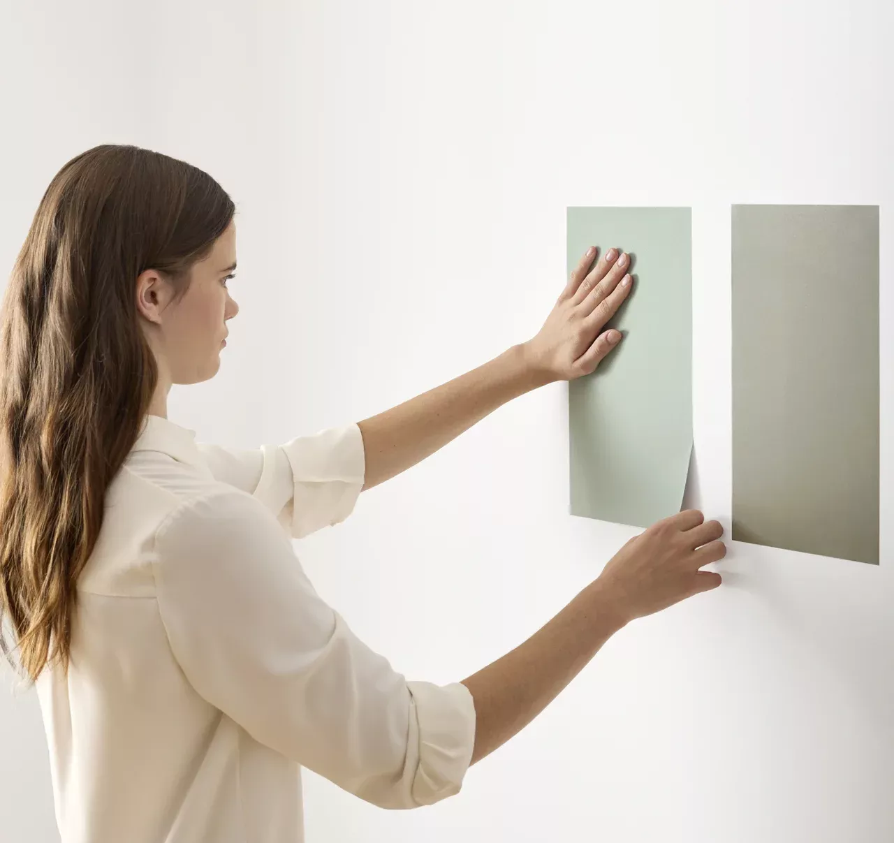
Use the visualizer to narrow your shortlist, then confirm the finalist on your actual wall. A peel-and-stick sample of Drift of Mist, checked in morning and evening light, is the last step before a gallon.
- Made with real paint
- Delivered next day
- Peels off clean
 4.8 · 1,842 reviews