Seapearl
OC-19 · Benjamin Moore


Benjamin Moore
Seapearl
OC-19
Subtle yellow-beige, a warm color
- Color family
- White
- Sold for
- Interior and exterior
Benjamin Moore Seapearl OC-19, written Sea Pearl about as often as it is written as one word, is a warm white with a soft gray hold and no obvious cream in it. Its LRV of 76 keeps a room bright while leaving enough body that the walls do not vanish into white trim. It is used across whole houses, inside and out, and it is one of the older Off White Collection names still specified constantly.
Source: Benjamin Moore's color data. Undertone labels describe our calculation, not the paint formula or a test in your room. How we assess colors.
Is Seapearl warm or cool? Undertones by the numbers
leans yellow
Undertone
Subtle yellow-beige
A gentle lean, quiet on the wall.
Seapearl measures a modest yellow with a trace of green under it and nothing red, roughly half the warmth of the creams it shares a deck with. That is the balance that makes it look soft rather than yellow: enough to warm a room, not enough to name. Set beside a bright white it shows both its warmth and its gray at once, which is why some people call it greige and others call it a white. Beside a cream such as Linen White OC-146 it looks almost cool. Its swatch calculation is nearly identical to Dove Wing OC-18, and the two are used interchangeably.
Seapearl in different lighting
North-facing rooms cool it toward a soft gray-white, and unlike a cream it does not turn dull there, which is a large part of why it gets used on north elevations and in north bedrooms. South rooms bring the warmth forward and it reads as a gentle off-white through the afternoon. In an east room it looks cleanest in the morning and greyer later. West sun late in the day gives it a short warm spell and then it settles. Bulbs at 2700K to 3000K keep the balance; anything cooler emphasizes the gray and drops the warmth out.
Watch for
- It reads grayer in a room with cool gray flooring than on a sample board
- On a north wall in the evening the warmth disappears completely
- Beside a cream trim white it looks gray rather than warm
Best rooms and surfaces for Seapearl
Seapearl is a whole-house white in the practical sense: light enough for hallways and stairs, soft enough for bedrooms, and steady enough to run through an open plan without looking different from room to room. On cabinets it gives a warm off-white that stays clean against both marble and wood, and it takes a satin sheen well because there is enough body in it to hide a brush mark. In a bathroom it works with warm stone and looks flat with cold gray tile. On a ceiling it sits comfortably above walls in the same color, and above a colored wall it reads white with a warm edge rather than stark.
Seapearl on an exterior
Benjamin Moore sells Seapearl for exterior use, and this is one of the colors that gets asked about for siding as often as for walls. Direct sun raises it toward a plain warm white, so a sunlit face reads lighter than the chip, while the shaded elevations, porch ceilings and eaves keep the gray. Because the shift runs toward white rather than yellow, it stays predictable across a whole house through the day, which is what makes it a common shingle-style and coastal choice.
Try Seapearl on your own walls
Upload a photo of your room, or the outside of your house, and TryMyHome renders Seapearl onto the walls for an illustrative preview beside your floors and furniture. Confirm the color with a physical sample. Your first 3 renders are free.
Seapearl vs White Dove, Pale Oak, Swiss Coffee, Dove Wing and Classic Gray
 White DoveSeapearl
Seapearl vs White Dove OC-17
Seapearl is noticeably darker; undertone subtle yellow-beige vs subtle yellow-leaning green. Based on published LRV and our swatch classification.
White Dove OC-17 is the brighter of the two by about seven points, and it holds slightly less yellow, so it reads as a soft white where Seapearl reads as a warm white with visible gray. Rooms painted in White Dove look lighter; rooms painted in Seapearl look quieter. The two work together, White Dove on the trim and ceilings above Seapearl walls, and that pairing is common in houses that use both.
 Pale OakSeapearl
Seapearl vs Pale Oak OC-20
Seapearl is noticeably lighter; both fall in our subtle yellow-beige category. Based on published LRV and our swatch classification.
Nearly eight points of brightness separate them, with similar warmth in both, so Pale Oak OC-20 is what Seapearl becomes if you drop it a full step. Pale Oak reads as a greige and shows more of its character in good light; Seapearl holds its lightness even in a dim hall. A house often wants both, Seapearl where the rooms are dark and Pale Oak where there is enough glass to carry it.
 Swiss CoffeeSeapearl
Seapearl vs Swiss Coffee OC-45
Seapearl is noticeably darker; both fall in our subtle yellow-beige category. Based on published LRV and our swatch classification.
Swiss Coffee OC-45 sits five and a half points brighter with about the same amount of warmth, which makes it the white version of the same idea. In a bright room Swiss Coffee can look plain and Seapearl keeps some depth. In a dark room the reverse is true and Swiss Coffee gives back more light. Trim is the deciding factor: Seapearl needs a clean trim white to look intentional, and Swiss Coffee does not.
 Dove WingSeapearl
Seapearl vs Dove Wing OC-18
Seapearl is a touch darker; both fall in our subtle yellow-beige category. Based on published LRV and our swatch classification.
Dove Wing OC-18 measures a hair brighter and otherwise the same, close enough that the two are effectively one color in a finished room. Benjamin Moore keeps both because they came from different decks, not because they behave differently. Anyone comparing samples of the pair is better off spending the effort on the trim white instead, which will change the room far more than choosing between these two.
 Classic GraySeapearl
Seapearl vs Classic Gray OC-23
Seapearl is a touch lighter; both fall in our subtle yellow-beige category. Based on published LRV and our swatch classification.
Classic Gray OC-23 is about three points darker and a little less yellow, so it reads cooler and grayer while Seapearl keeps a warm edge. In a room with cool gray floors, Classic Gray ties in and Seapearl looks slightly cream. In a room with oak, the opposite happens and Classic Gray can look chalky. Pick by the floor rather than by the swatch.
Questions about Seapearl
What colors go with Seapearl?
Benjamin Moore's own scheme for it starts with Feather Down OC-6 as the warm light partner, then Sleigh Bells 1480, Arctic Shadows 1559 and Knoxville Gray HC-160 for depth. The last is a dark gray-green, and that combination of a soft white with a muted green-gray is the classic coastal reading of this color. Oak floors, rattan and aged brass fit it easily.
Is Seapearl a good exterior color?
It is one of the more popular exterior whites in this family, and it is sold for exterior use. On siding it wants dark contrast to hold its shape: a black or bronze roof, dark window frames, or a stained wood door. A crisp white trim such as Chantilly Lace OC-65 reads as a clear line against it, while a cream trim will make the body look gray.
Does Seapearl look gray?
In cool light and in rooms with cool floors, yes, and that gray is part of why people choose it over a cream. The measurement carries a modest yellow with a trace of green, so the color moves along the warm white to soft gray line and never toward pink or blue. Under warm bulbs at night the warmth returns and the gray recedes.
Is China White the same as Seapearl?
In our swatch calculation they are the same color: identical hex value, identical light reflectance, and Benjamin Moore lists the China White OC-141 code among Seapearl's other numbers. The two names come from different fan decks rather than different formulas. Order by whichever code your painter's deck shows and the can will match.
Is there a Sherwin-Williams version of Seapearl?
Grey Mist SW 9625 is the closest match in our swatch comparison, near enough that the two would be hard to separate on a wall, though it has no page here. Nuance SW 7049 is next. Of the Sherwin-Williams colors with full pages, Pearly White SW 7009 is the closest and sits about a point brighter with a similar soft warmth.
Get a sample before you paint
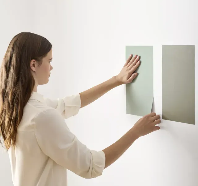
Use the visualizer to narrow your shortlist, then confirm the finalist on your actual wall. A peel-and-stick sample of Seapearl, checked in morning and evening light, is the last step before a gallon.
- Made with real paint
- Delivered next day
- Peels off clean
 4.8 · 1,842 reviews

Trim, ceiling and coordinating colors for Seapearl
Benjamin Moore lists no trim white per color, so this is practice. Seapearl walls want a cleaner white on the woodwork: Chantilly Lace OC-65 gives the sharpest line, Simply White OC-117 a gentler one, and Decorator's White OC-149 suits a room with cool stone. White Dove OC-17 is the softest of the four and the usual answer when the whole house should stay warm.
Colors similar to Seapearl
Closest matches for Seapearl in other brands
These are the closest digital colors in our catalog, not equivalent paint formulas or touch-up substitutes. Compare physical samples in the same finish before choosing. See the comparison method.